In his best-selling book Cracking the Quebec Code, Jean-Marc Léger wrote “Political polls make for about 1% of all my revenues, but account to 99% of my problems.”
So, why do it then? For many market-research firms, political polling serves as an efficient way to promote their brand, attract customers and, when successful, show clients their numbers can be trusted. In a functioning supply-and-demand market, polling firms whose results are constantly and systematically off the mark are doomed to fail in the long run, not dissimilar to Darwinian economics. (Nevertheless, it should be stressed that even the best polling firms occasionally miss the mark—such is the nature of statistics, and the challenge of aiming at a constantly moving target.)
“But there is more to polling than voting intentions,” I have been told many times, and rightly so. Polling on social issues can be far more important to understand the political landscape than merely measuring the horserace. However, the reason I do not pay much attention to polls that do not include voting intentions is, simply, that their results are not verifiable.
For instance, imagine a market research firm X that publishes a poll indicating, say, that 80 per cent of Canadians are in favour of stricter gun control, or that 25 per cent of Canadians will not take a COVID-19 vaccine under any circumstance. How does one know whether the data is correctly calibrated? How do we know the results aren’t skewed, even involuntarily so?
Now, say, hypothetically, that same poll measures the Conservatives leading the Liberals by 25 points nationally. Given that the current 338Canada projections (based on a weighted rolling average of polls) show the Liberals ahead by a margin of 4 to 8 points, how much traction and/or media attention should this poll be given, especially the results from its questions on social issues? (“Very little to none” would be the correct answer.) Voting intentions are the only data points that are actually verifiable by experience.
Additionally, since close to a dozen firms regularly poll federal voting intentions in this country, we can compare the results between those firms and keep track of all the numbers over time.
Because elections do occur from time to time, and they represent the perfect opportunity to compare poll results with election results. We may then compile every firm’s report card (see 338Canada’s ratings of Canadian pollsters here). Which firm was right, which one was off? By how much? And which party did the results lean towards? Is the error systematic or does it fluctuate from one party to the other?
We present today graphs and data to measure, if any, the “House Effect” of Canadian polling firms in federal polls. This analysis will focus on the voting intentions for the federal Liberals and Conservatives spanning the last three years, from January 2018 to July 2021 (and we’ll analyze numbers from other parties at a later date).
Here is a “bullseye graph” that compares all the federal polls during that time period with the rolling 338Canada average (Liberals horizontally, Conservatives vertically).
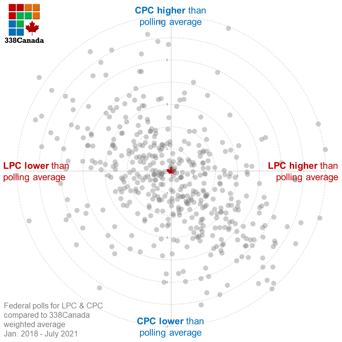
The scales of the graph represent the number of percentage points off the average at the time of each poll’s middle field date.
As you may expect, the bullseye is surrounded by dots spread in a near-symmetrical fashion. In the long run, the better calibrated and accurate firms should have polls spread almost evenly around the bullseye. In short: Polls near the bullseye were close to the weighted averages during their field dates; those far away from the centre are either statistical outliers or precursors of new trends. (All the polls used in this analysis are listed on this page.)
Let us look at the same graph, but with added coloured dots to identify polls by firm. Here is the graph for Léger (green dots):
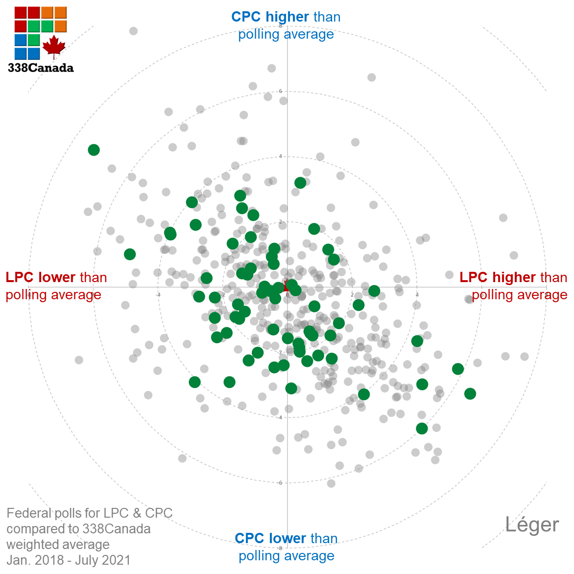
As you can see, Léger polls are spread almost symmetrically along the upper-left to lower-right diagonal. A few Léger polls were several points off the average at the time of their field dates, but most dots are located near the bullseye. This is a well calibrated graph.
Here is the same graph for Nanos Research:
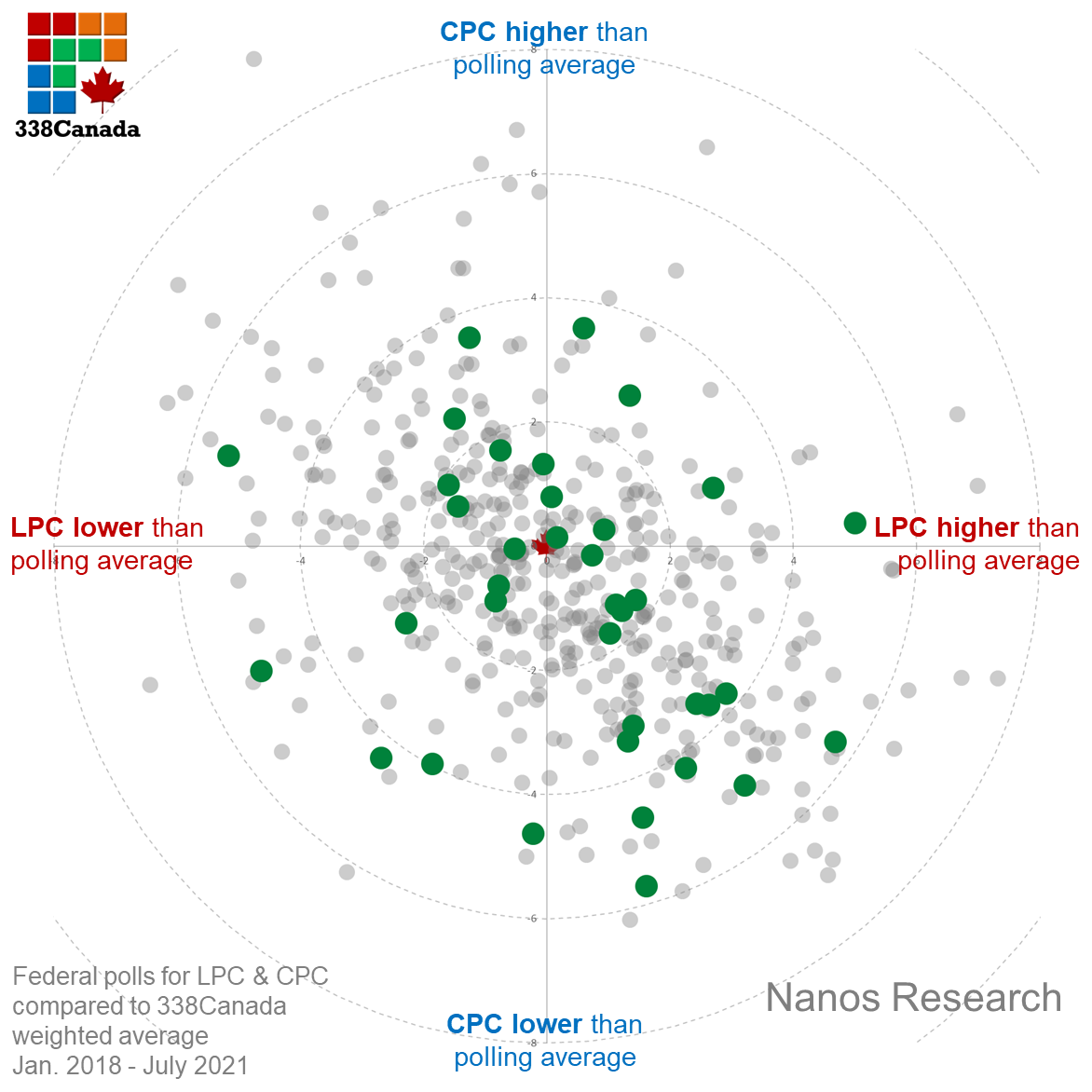
Of note: most of Nanos Research polls are weekly rolling polls, so only one poll per four-week cycles are depicted on the graph. Once again, we notice the dots are nearly evenly spread.
Here is the graph for Ipsos:
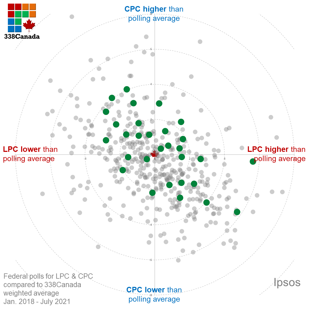
As with Léger and Nanos Research, Ipsos polls are neatly spread around the bullseye with no apparent, systematic skew.
Here is the graph for Abacus Data:
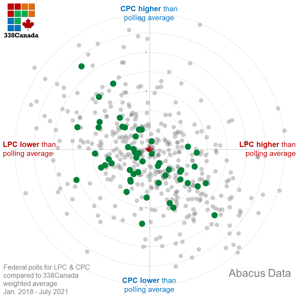
Same story here. Although there are slightly more polls on the lower half of the graph (hence, lower CPC numbers), we see no major skew in the data.
Here is the graph for Mainstreet Research:
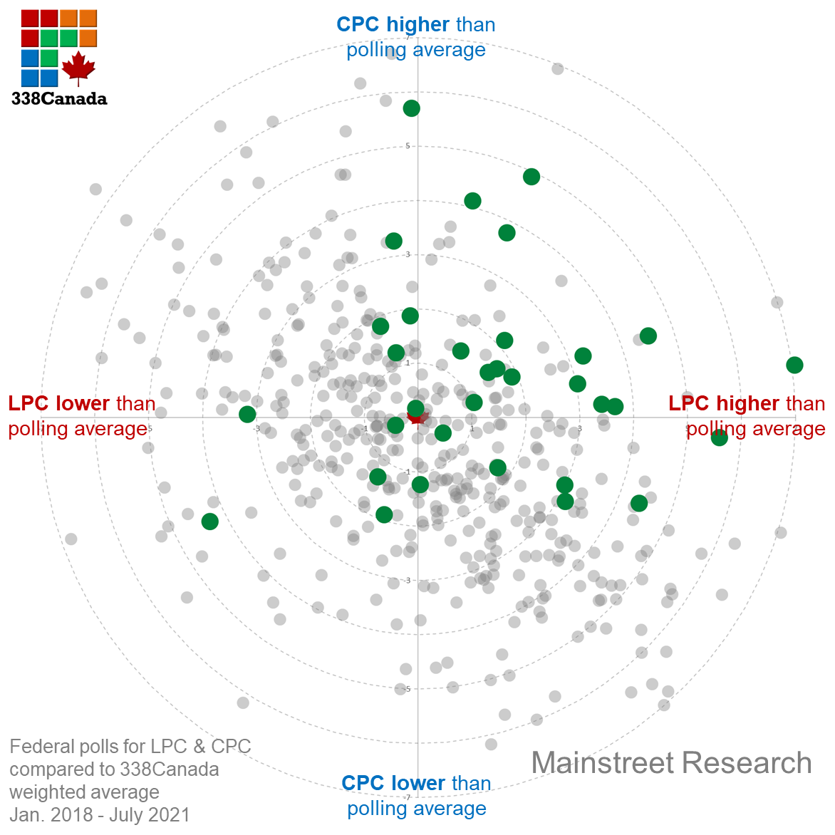
Mainstreet Research’s federal polls appear to have a slight tilt toward the upper-right quadrant of the graph, meaning high LPC and high CPC numbers than the rolling average (hence lower NDP). However, averaging those out (as we will show below), we measure no major skew.
Here is the graph for Innovative Research Group (IRG):
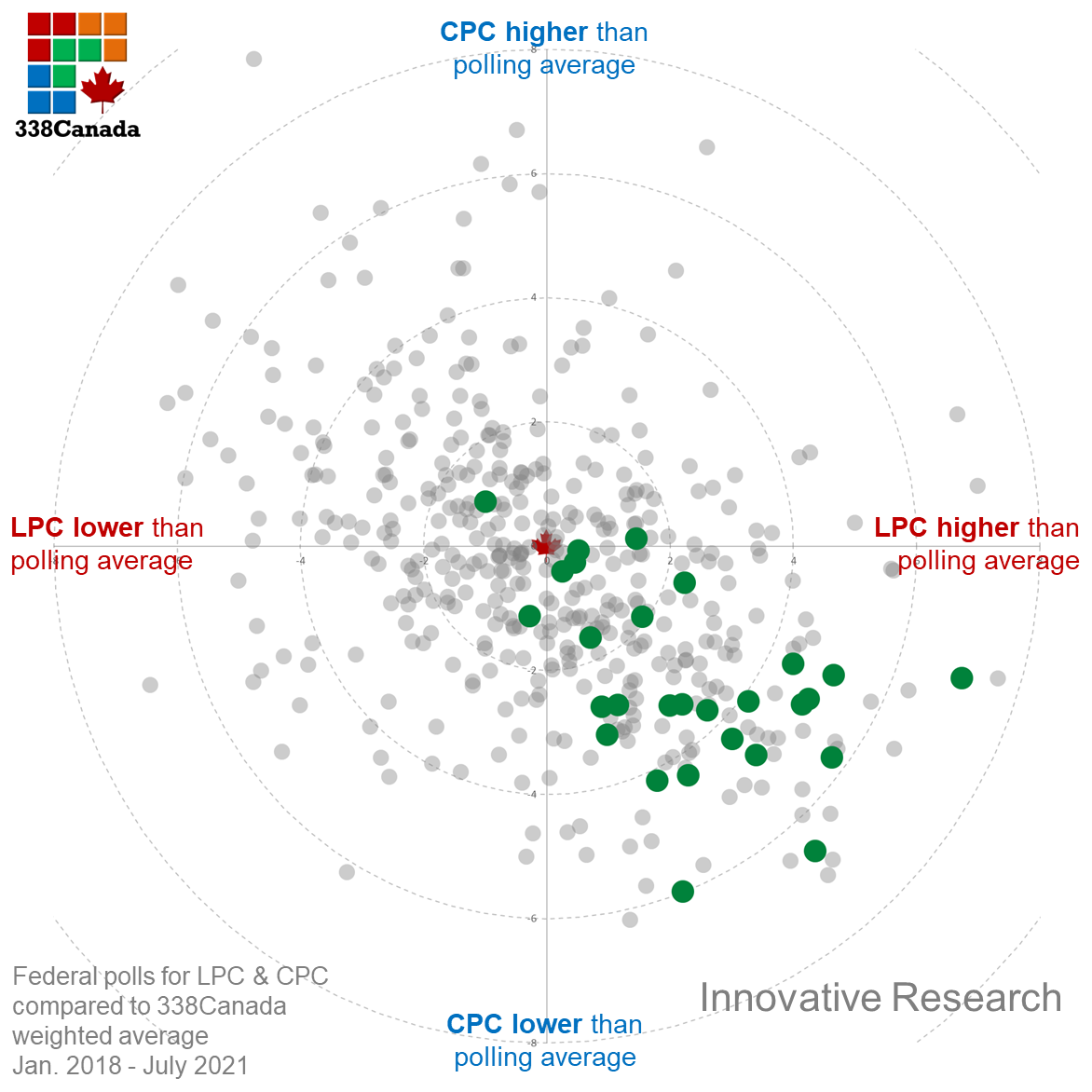
Regular readers of this column and polling nerds may have noticed that IRG polls often seem to be favourable to the Liberals, and that impression would be backed by the data. As you may see on the graph, polls from IRG are almost all located in the lower-right quadrant, meaning high LPC and low CPC numbers. This is a clear example of a systematic house effect. From a purely statistical point of view, it simply cannot be a coincidence that all these dots lean towards the same direction. It does not mean that IRG polls are wrong or unusable, but we must use caution and interpret them in the context.
Finally, here is the graph for the Angus Reid Institute (ARI):
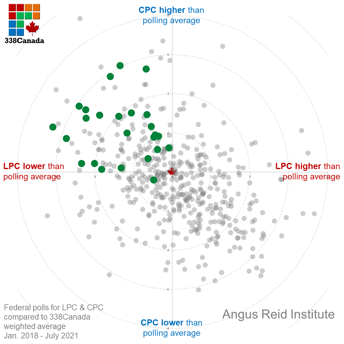
We see here the opposite tendency of IRG: Virtually all of Angus Reid’s polls are located in the upper-left quadrant, meaning high CPC and low LPC numbers compared to the poll average. This also shows a systematic house effect. Interestingly though, this measurable tilt towards the federal conservatives does not translate into a noticeable skew in Angus Reid’s provincial polls.
In conclusion
By calculating the average skew from each firm that regularly polls federal voting intentions, we get the following graph:
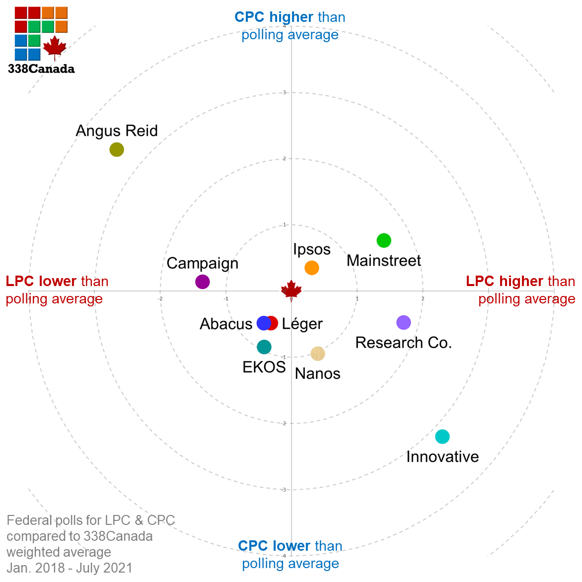
Eight of 10 firms depicted on the graph are located within the 2-point radius, which, all things considered, should be seen as a minor skew over the past three years. As for Innovative and Angus Reid, they appear to mirror each other from opposing quadrants.
“But what if either those firms are correct and everybody else is wrong?” In the 2019 federal election, the final poll from Angus Reid had the Conservatives winning by 5 points over the Liberals. As for Innovative Research, its final numbers showed a two-point win vote for the Liberals. The Conservatives ended up winning the popular vote by one point. Angus Reid had the LPC a little too low, and IRG had the CPC a little too low. The overall numbers were fairly accurate, but they skewed in the same general direction as depicted above.
Again, I want to emphasize this point: It is not that their polls are necessarily wrong or unusable. They generally observe the same tendencies as their competitors, which is why their work still has tremendous value (and are regularly and rightly quoted by news outlets across the country, including this magazine). But while they see the tide moving the same way as other polling firms, they appear to measure it from a slightly different water level.
Follow 338Canada on Twitter
The post Federal election 2021: Know your pollsters appeared first on Macleans.ca.
-------------------------------
By: Philippe J. Fournier
Title: Federal election 2021: Know your pollsters
Sourced From: www.macleans.ca/politics/ottawa/federal-election-2021-know-your-pollsters/
Published Date: Fri, 06 Aug 2021 18:46:47 +0000
Read More
Did you miss our previous article...
https://badpoliticians.com/world-politics/the-alternative-reality-government-is-now-available
 UK PoliticsWorld PoliticsVideosPrivacy PolicyTerms And Conditions
